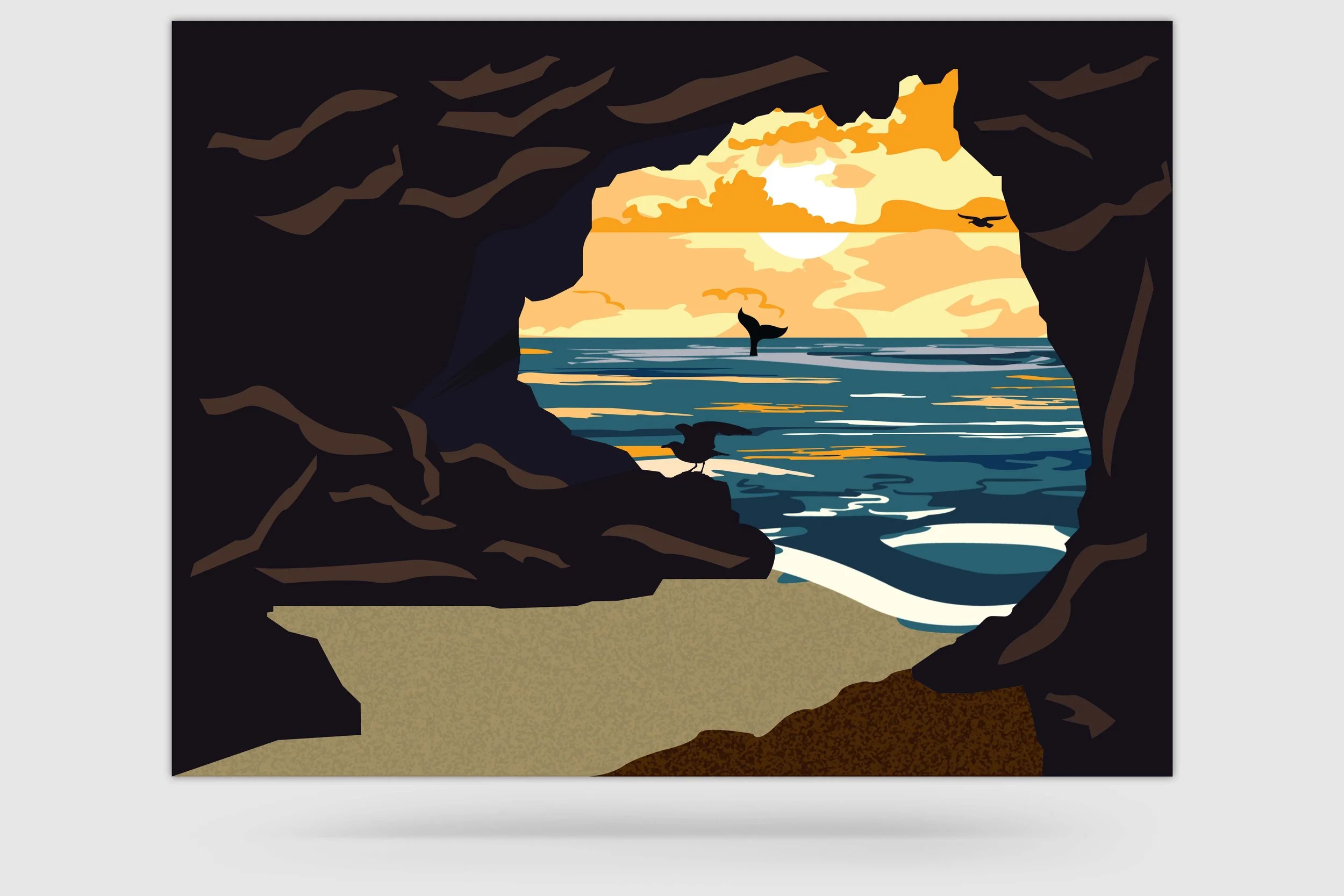
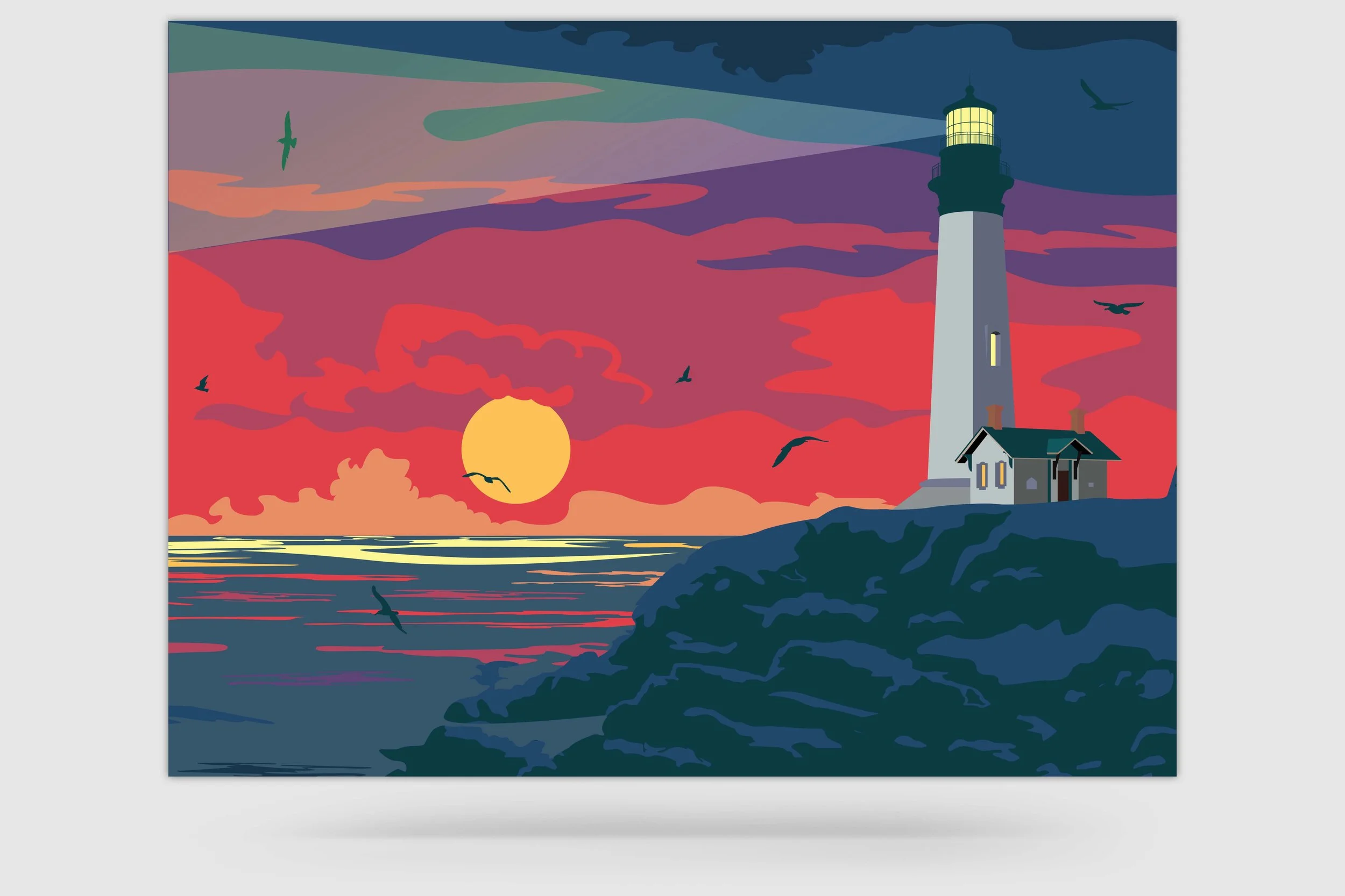
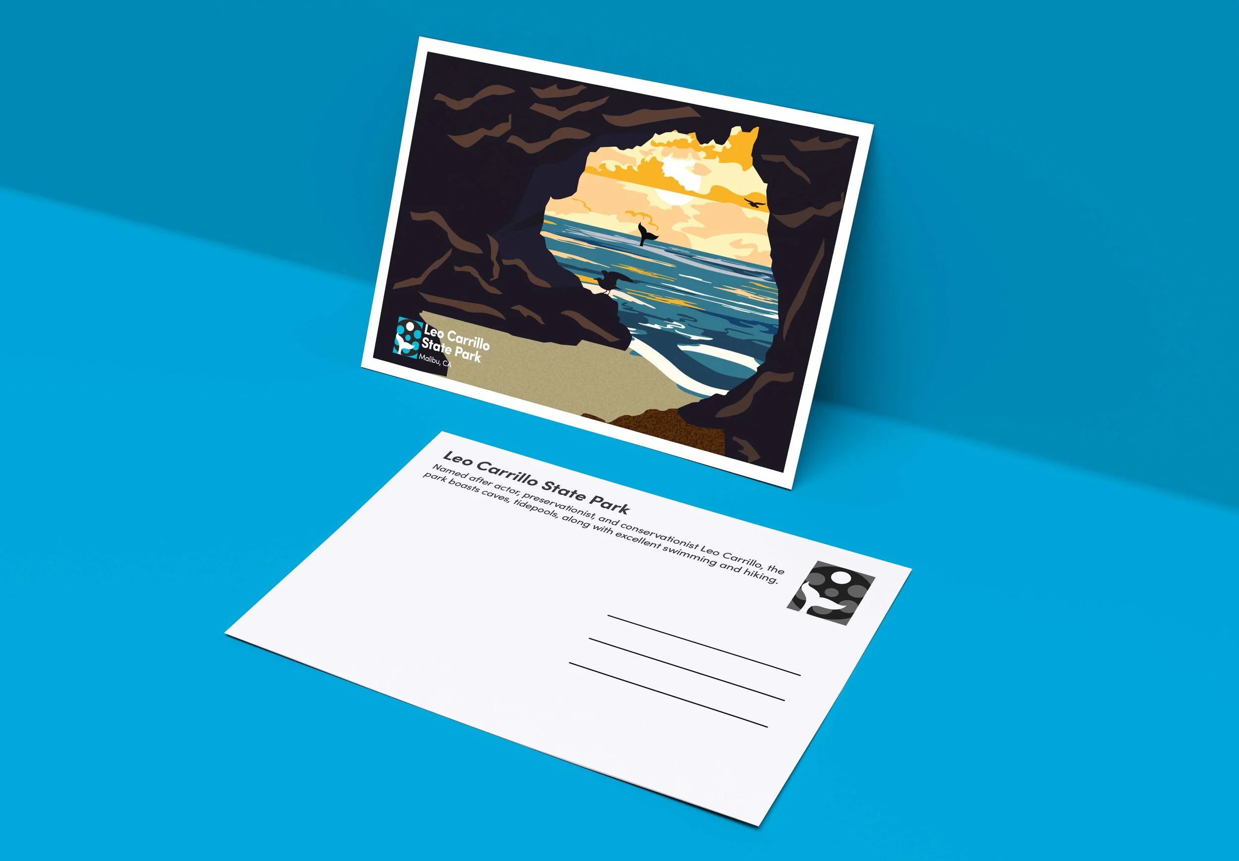
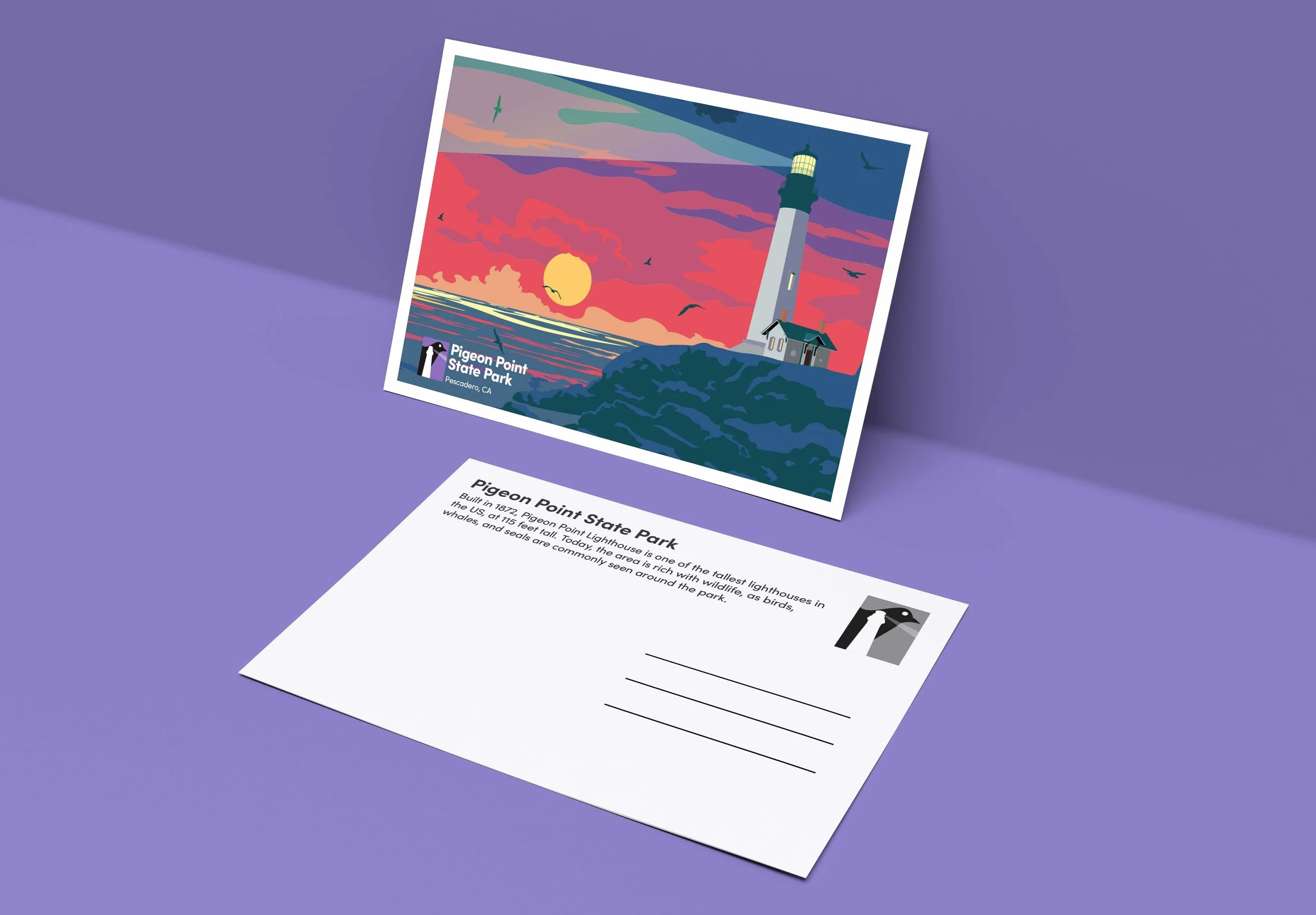
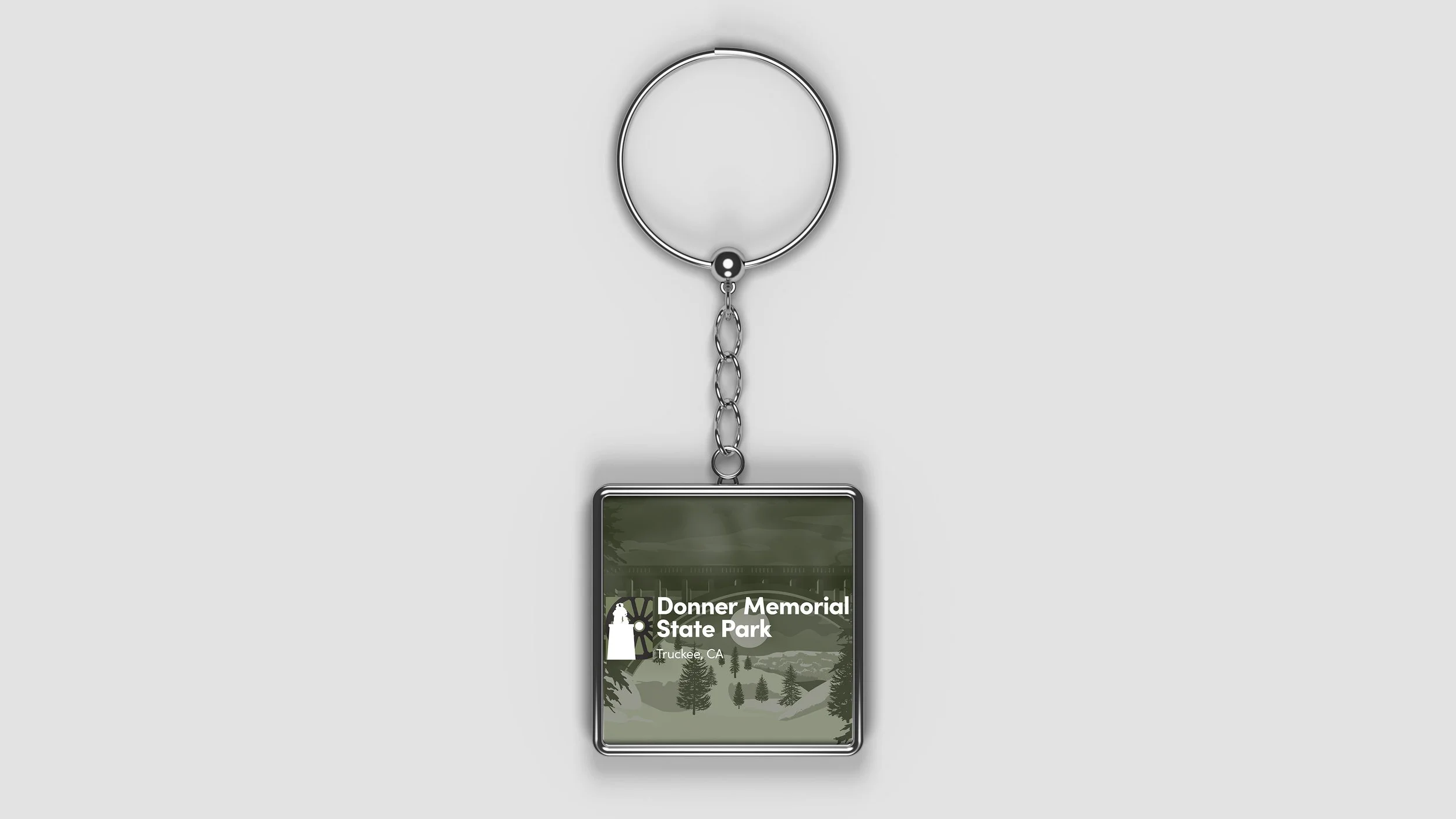
CALIFORNIA STATE PARKS: ILLUSTRATION AND LOGO SET
OBJECTIVE
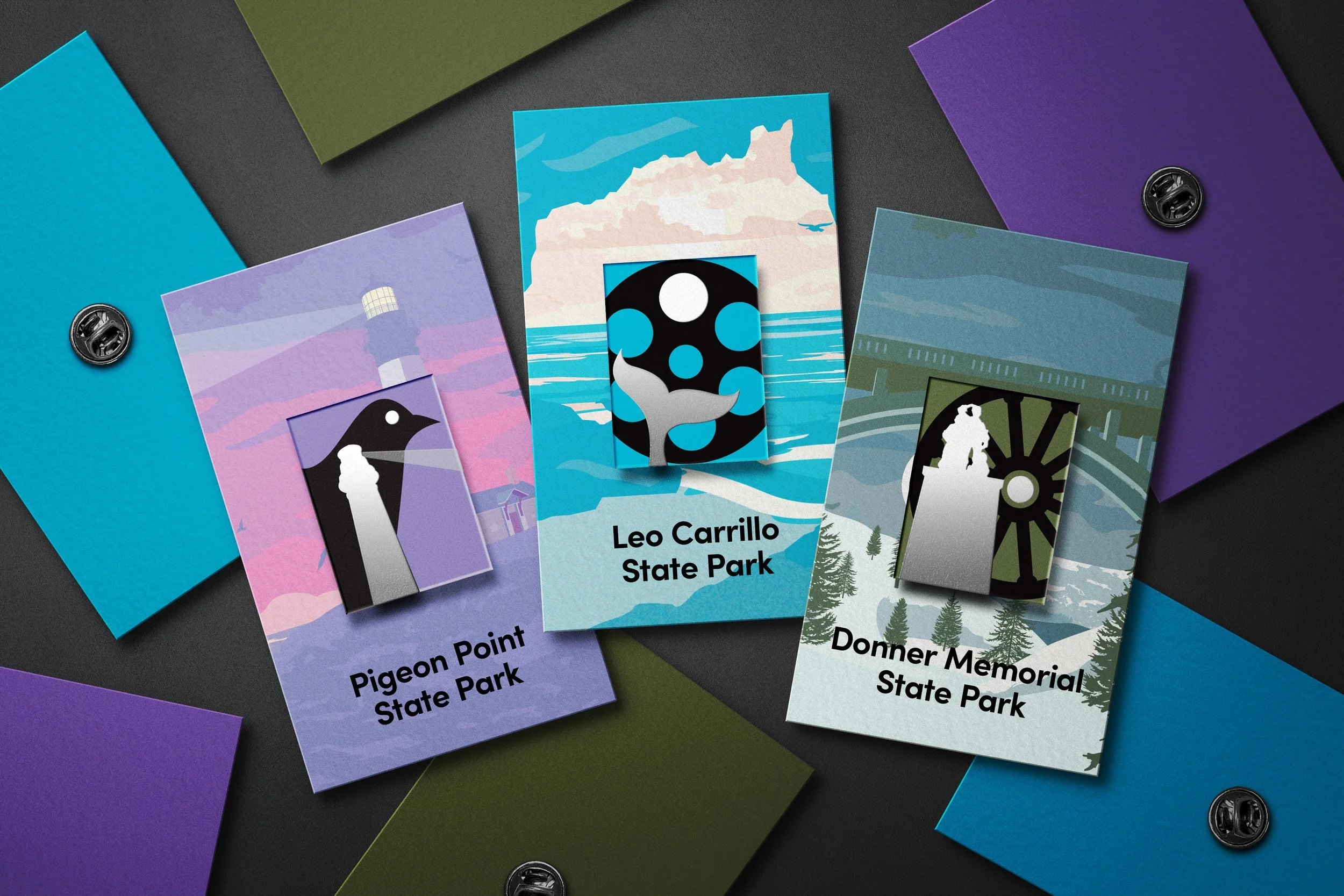
Design an illustration and a logo for three California State Parks, each with a modern feel. For the posters, draw inspiration from art styles and themes that were popular on travel posters in the 1920s and 1930s. The aim is to create an engaging and visually appealing design that conveys the unique features and attractions of each park.
The logos should also have a modern look and feel while utilizing a maximum of three colors. The challenge is to create a set of logos that are simple yet memorable and effectively represent each park's unique identity.
SOLUTION
The logos pay homage to California's State Parks by showcasing their natural beauty and historical significance. Each logo incorporates three colors; white to represent the park's distinctive features, black to signify its name's origins, and a background color that matches the overall theme of the park. A white circle symbolizing the sun or moon serves as a unifying element across all logos. The bold colors in each illustration accentuate the park's scenic wonders and incorporate bold silhouettes, reminiscent of classic travel posters.


